


RBC's Mobile Banking: Figo
TIMELINE: 1 week
ROLE: UX/UI Designer
TOOLS: Sketch, Invision, pen on paper
TEAM:
Izzy Lourdes
Dan Guerra
Calvin Kuo
Richard Szeto
About
Figo is a mobile banking app designed to help young professionals make the best financial choices, so that they can achieve financial stability more easily and become lifelong Figo users!
Design Challenge
The Royal Bank of Canada's clients have been asking for a native mobile app for some time. Since customers can already manage their personal finances through the bank's responsive website, RBC wants their mobile app offering to provide value that uniquely speaks to each of their target customer types.
The Problem Space
While young professionals have the desire to achieve financial stability, they want to be able to achieve it without having to be financial experts.
Figo's goal is to:
Help young professionals make the best financial choices, so that they can achieve financial stability and become life-long Figo users!
Research Methods

Online research

User interviews
Contextual observation
Key Research Insights
Through the preliminary research that was conducted, we discovered the following:
I.
There is a low level of financial literacy in young people
II.
Banks tend not to market their services into the millennial space as often
III.
Transitioning from a young user account to an adult account results in the largest breakpoints
IV.
Saving is a larger issue for millennials than anything else
V.
70% of millennials use mobile banking, due to its ease and convenience
VI.
Brand loyalty is low - people will jump ship to whichever bank provides the best deals, rates, etc.
How might we...
Create a simple yet tailored banking experience, so that young professionals can set and achieve their savings goals with ease?
The next step
User Research
To better understand our users, a series of interviews were conducted to gain deeper insight into user behaviours.
User Test Plan Summary
With our problem space identified, a user test plan was created to determine how the Figo mobile banking app would function in a practical sense, as well as determine what works and what needs improvement. Through usability tests, we were able to obtain valuable feedback that allowed to further improve the design and provide an optimal user experience throughout the app.
Scenario and Tasks
For the purposes of these usability tests, the user was to complete a series of tasks as an existing user of the Figo's banking website, who has yet to use their mobile app offering. The assigned tasks were as follows:
I.
Log in to the Figo app as an existing user
II.
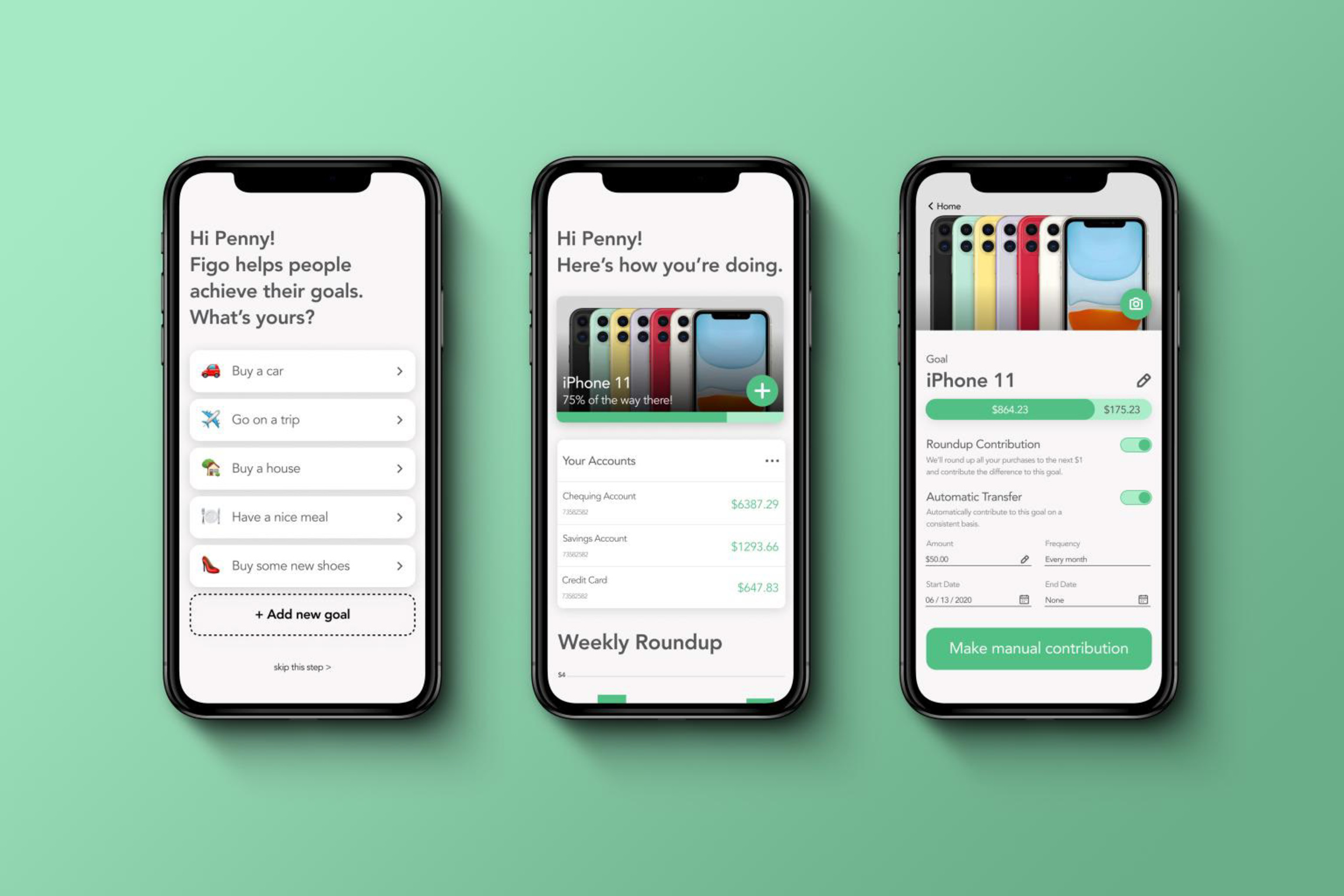
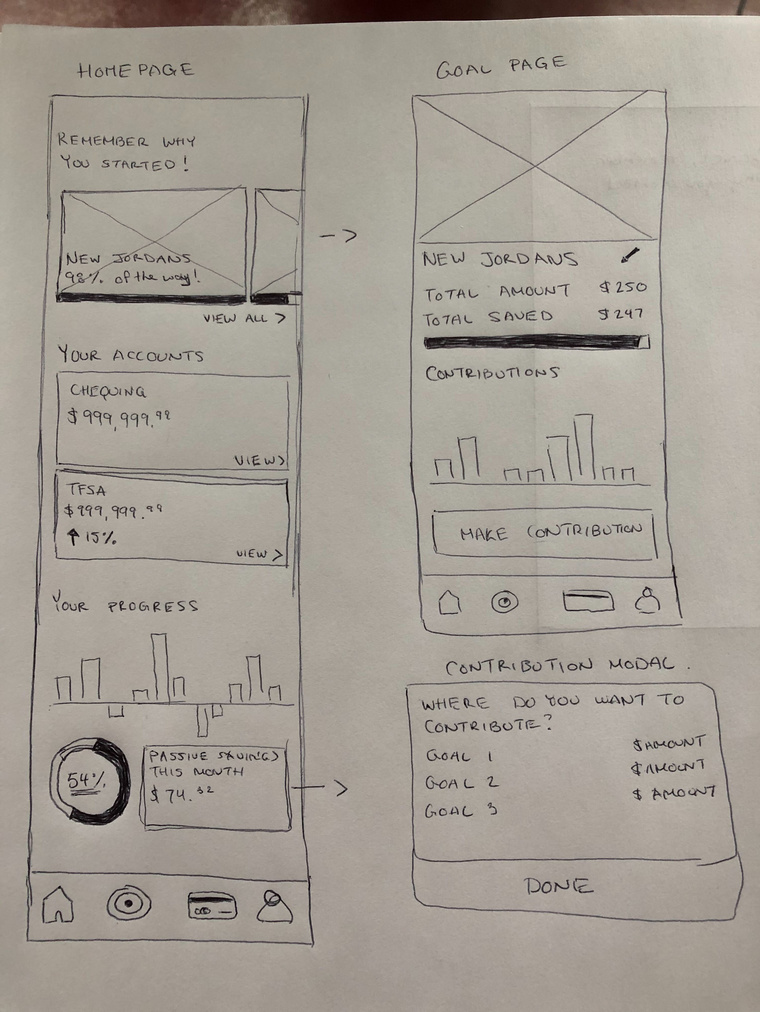
Set a savings goal for an item they want (ex. the iPhone 11)
III.
View the savings goal they've set in the app
III.
View the details related to their savings goal
User Testing Insights
I.
Users were confused about why they were prompted to sign up for a new account, when they were already existing users of the Figo web application
II.
Some of the application's text was too small, not meeting the standard accessibility guidelines
III.
Users were unsure of how to make a manual contribution to their set savings goal within the Figo app
User Persona

Meet Penny!
- 28 years old
- Graduated post-secondary three years ago
- Makes $55,000 a year
- Wants to upgrade to a new iPhone, as hers is outdated and has gotten slow
- Has some concerns about her spending habits, as she isn't very financially savvy
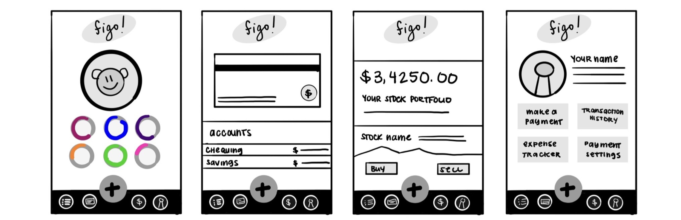
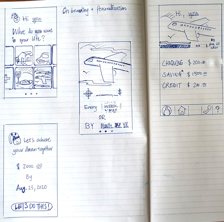
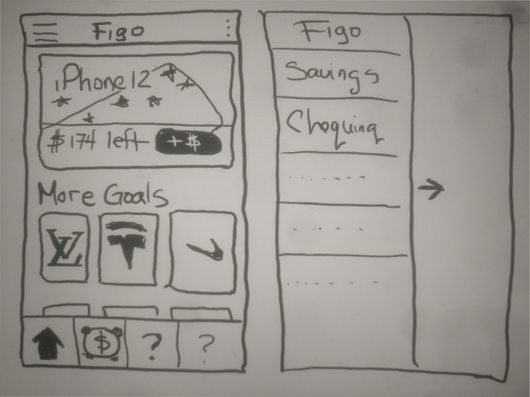
Concept Sketches
Colour Palette
#C8E9F8
#52BF85
#FE6955
#55575A
#F8F6F6
#ABECC9